
I have read a lot of landing page advice that sounds good and says nothing. Ten rules that could apply to any business, any industry, any city. You finish reading and still have no idea what to actually change on your own page.
This article is different. Every practice below is paired with a real page from a real business, a moving company and a luxury pet resort, so you can see exactly what works and why. No theory, no stock advice. Just what actually converts, shown in the open.
What Is a Landing Page?
A landing page is a single page built for one purpose. Someone clicks an ad, a search result, or a link, and lands here to take one specific action. Book a call, request a quote, sign up. Nothing else competes for their attention.
I bring this up because so many small businesses use their homepage for this job instead. The homepage has to do everything. It welcomes visitors, explains every service, and links to ten other pages. A landing page does none of that. It exists for one visitor, with one need, at one moment. When you and your team are clear on that difference, you stop building pages that try to please everyone and start building pages that actually convert.
12 Landing Page Best Practices That Actually Work
I could give you a generic checklist. Instead, every practice below comes paired with a real page from a real business, so you can see exactly what it looks like when it is done right.
1. Match Your Headline to Search Intent
When someone searches for a local move, they already know what kind of move they need. A generic headline like "Moving Services" makes them work to confirm you can help.
Two Small Men With Big Hearts gets this right. Their Vancouver Local Moving page and their Vancouver Long Distance Moving page each open with a headline built for that exact search. No guessing required.
2. Show Proof of Locality Above the Fold
If someone lands on your page wondering whether you actually serve their area, that doubt needs to disappear immediately. Waiting until the footer to show your address is waiting too long.
Jet Pet Resort places their location and phone number right at the top of the page. A visitor confirms in two seconds that this is a real, nearby business, not a directory listing or a franchise shell.
3. Use One CTA, Repeated
Every extra option on a landing page is a chance for the visitor to leave without converting. One clear action, asked for more than once, outperforms five buttons fighting for attention.
Two Small Men keeps their quote form visible without scrolling, then repeats the same ask further down the page. The visitor never has to hunt for what to do next.
4. Reduce Form Friction
The bigger the ask, the fewer people follow through. A long form with no context feels like a commitment before the visitor even trusts you yet.
Jet Pet Resort offers a free one hour assessment before asking for any real commitment. That small step lowers the stakes enough that more people actually take it.
5. Use Specific, Quantified Social Proof
"Great service" tells a visitor nothing. Numbers and names tell them everything, because they are hard to fake and easy to trust.
Two Small Men leads with "100K+ Moves" and pairs it with reviews that include a real name and city. Compare that to an anonymous five star rating with no context, and it is not close.
6. Show Your Service in Action, Not Stock Photos
A stock photo of a smiling model tells a visitor nothing about your actual business. Real photos do the opposite work. They build trust before a single word is read.
Jet Pet Resort shows their real 15,000 square foot facility, including webcams pet owners can use to check in. That level of transparency is difficult to fake, which is exactly why it works.
7. Build Hyper Specific Pages Instead of One Generic Page
One page trying to serve every visitor ends up serving none of them well. A visitor with a specific need wants a page that speaks to that need directly.
Two Small Men builds separate pages by city and by move type, so a senior moving locally and a family moving long distance each land on a page written for them. This is topical depth applied at the level of your whole site, not just one article.
8. Design Mobile First
Most of your visitors are not sitting at a desktop. They are scrolling on a phone between errands, and a page that was designed for a large screen first often breaks under that reality.
Industry data puts mobile visits at roughly 83 percent of all landing page traffic today. If your page is not built mobile first, you are optimizing for the smaller slice of your audience.
9. Remove Navigation Distractions on High Intent Pages
Your main navigation menu exists to help visitors explore. On a landing page, exploring is the enemy of converting.
Every link away from the page is an exit ramp. Strip the menu down or remove it entirely on pages built for one specific action, and you keep the visitor focused on the one thing that matters.
10. Use Directional Visual Hierarchy
A visitor's eye needs somewhere to go. Without guidance, everything on the page competes for attention equally, and equal attention means no attention.
Simple tools work here. An arrow, a contrasting color, or a well placed image can point a visitor straight toward your headline, your proof, and your call to action, in that order.
11. Say Thank You
The moment someone submits your form is not the end of the interaction. It is the start of a new one, and most businesses waste it.
A dedicated thank you page confirms the submission actually worked, which many forms fail to do clearly. It is also your best chance to offer a next step while the visitor is still engaged.
12. Test and Iterate
No landing page is finished the day it goes live. What converts for one audience in one industry rarely transfers perfectly to another.
Treat your first version as a starting point, not a final answer. Small changes to a headline, a CTA, or a testimonial can move conversion rates more than a full redesign.
Local Landing Pages vs. Generic Landing Pages
A generic landing page speaks to anyone who might land on it. It talks about the industry in broad strokes, uses stock photography, and hopes the message is relevant enough to whoever shows up. That approach used to be good enough. It rarely is anymore.
A local landing page speaks to one person, in one city, with one need, right now. It names the neighborhood, shows a real phone number, and proves the business actually exists where the visitor is standing. That difference alone often decides whether someone stays on the page or bounces back to the search results.
I have watched this play out with clients over and over. The businesses that win in their local market are rarely the ones with the biggest budget. They are the ones whose pages feel like they were built for the exact person reading them. If you want help figuring out where your own pages fall short, that is exactly what I dig into in my SEO strategy work.
Real Landing Page Examples Breakdown
Here is a closer look at what these two businesses get right, and why it works.
Two Small Men With Big Hearts (Moving Company)
This moving company built its landing pages around one core idea. A visitor searching for a local move and a visitor searching for a long distance move are looking for two completely different things, even though both are technically moves. Instead of forcing both into one page, they split them apart, then split again by city and by audience, covering everything from senior moves to commercial relocations.
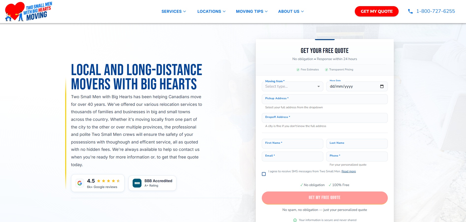
The result feels less like a website and more like a company that actually understands the visitor's exact situation. Combine that with quantified proof like "100K+ Moves," reviews tied to real names and neighborhoods, and a quote form that never disappears, and you get a page built to answer the visitor's doubts before those doubts even form.
Jet Pet Resort (Luxury Pet Boarding)
Boarding a pet comes with real anxiety for most owners, and this page is built around easing that anxiety at every step. The location and phone number sit right at the top, so a worried pet owner confirms in seconds that a real, nearby facility is behind the page. From there, real photos of the 15,000 square foot space and live webcams replace anything a stock photo could offer.
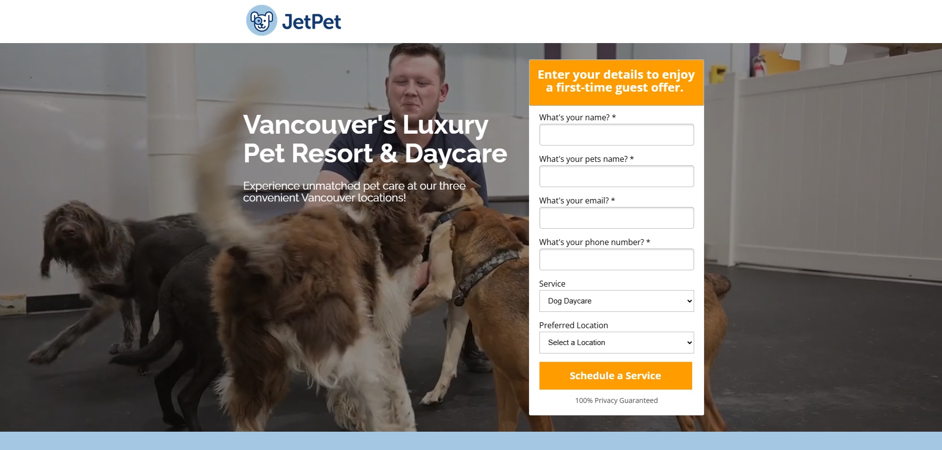
The offer itself lowers the stakes even further. A free one hour assessment gives a hesitant pet owner a low commitment way to trust the business before booking a full stay. That single detail does more to move someone from browsing to booking than another paragraph of marketing copy ever could.
Common Landing Page Mistakes to Avoid
I see the same handful of mistakes on almost every local landing page I audit. None of them are complicated to fix once you know to look for them, but they quietly kill conversions when they go unnoticed.
- Sending every visitor to the homepage instead of a page built for their exact search
- Hiding the location and phone number below several scrolls of copy
- Using five different calls to action that compete with each other
- Filling the page with stock photos instead of real proof of the business
Each one of these undoes a practice covered above, which is exactly why they matter so much. A hyper specific page loses its advantage if the visitor still lands on a generic homepage. A strong CTA loses its power if it is buried under four other options. Fixing even one or two of these often moves the needle faster than any redesign.
Ready to Build a Page That Actually Converts?
Every practice in this article comes from pages that are already working for real businesses. None of it is theoretical, and none of it requires a full redesign to start seeing results. Most of the time, a handful of focused changes is enough to turn a page that gets traffic into a page that gets customers.
If you want a second set of eyes on your own landing pages, that is exactly the kind of work I do. Check out my SEO strategy service and let's figure out where your pages are losing people, and how to fix it.